One of the best ways to test your web design skills is to try and re-design any professional web page that already exists. You can pick anything like amazon eBay or even goal.com which we are currently working on. Here we start with something very simple by re-constructing the whatsapp download page. You can capture the following concepts from the code:
Align image logo with heading and navigation menu items, create a two column layout and nest a three column layout under a dual layout.Create simple buttons with the <p> element.
Under the downloads section we provide quick codes that you can easily integrate into your project. Code snippets includes designs for navigation menus forms tables lists links and other useful scripts.
CSS TEMPLATES
All the CSS that a student needs to know is provided under one file.. It is a very useful css tool kit with over 90 codes provided in both text and html format. Get the file here:Download
The three most used navigation types are the left right and center aligned navigation menus. History has proven that it is difficult to get these right especially for newbies. You can get the three menus here: Download
FORM ELEMENTS
Here we provide you with useful form elements, download the forms here: Download
TABLES
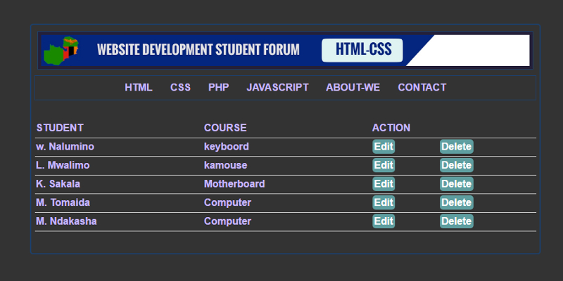
Tables are as interesting as a complex woman. Here we provide you with three different types of commonly used html-css tables: Download
LISTS
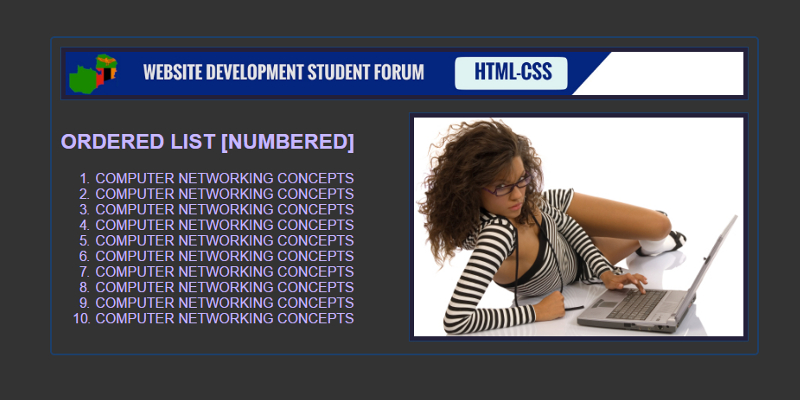
Download ordered and unordered lists right here: Download
FLOAT IMAGES
Images can be positioned on a web page using the float property. We explore the float left right and center css image positioning. Download
APPLYING IMAGE BORDERS
We can apply borders margin and padding to an image on our web page using a variety of techniques. Download
IMAGE LINKS
We can use images the same way we use the anchor element to link to both internal and external destinations. Download
When we create a navigation menu we use the unordered list <ul> element and <li> items and by default it is displayed as vertical menu. We then use the float property to transform it into a horizontal menu. That is the only difference between the vertical menu and the horizontal menu. If you remove the float property from the horizontal menu you get a vertical menu.Most of the css styles remain the same.
When we run this code we get a vertical
navigation menu. The menu items will be blue and underlined and with bullets.
We can use the following css to style the menu.
CSS STYLES FOR A NAVIGATION MEU
#menu ul {list-style-type: none; margin: 0;padding: 0;}
There is no
strange css here list-style type removes the bullets from the list and
text-decoration none removes the underline. li:hover defines what happens to
the background onmouseover. The rest speaks for itself.
So we want to
include both the vertical and the horizontal menu so that you can compare and
contrast the two types of menus. Just like you did with the khoi-khoi and the
Bushmen in history at junior secondary.
Vertical menu are mostly used to create dashboards for the administration page of your web application. You can download this and all the layouts we have looked at here: Web layouts
The division tag <div> defines a section in an html document and we can deploy a very simple procedure to design a multi-column web page. This method is the modern way of creating such a website theme. We follow the following simple steps to create a multi-column web page.
Create a parent <div>
element
Create child <div>
elements under the parent <div>: These make up the columns
Float the child <div>
elements to the left apply some padding and some width
Finally clear the floats
The number of
child <div> elements will determine how many columns will be included in
the web page. In a four column layout the parent <div> element will host
four child <div> elements.
Notice that the parent <div> has four child <div> elements and each is set to a width of 25% floated to the left and given a padding of 10px and after that we clear the floats with css. These are the three main properties that you need to create a multi-column layout. When you get the layout right you can proceed to add more css to beautify your sight.
The division tag <div> defines a section in an html document and we can deploy a very simple procedure to design a multi-column web page. This method is the modern way of creating such a website theme. We follow the following simple steps to create a multi-column web page.
Create a parent <div>
element
Create child <div>
elements under the parent <div>: These make up the columns
Float the child <div>
elements to the left apply some padding and some width
Finally clear the floats
The number of
child <div> elements will determine how many columns will be included in
the web page. In a three column layout the parent <div> element will host
three child <div> elements.
Notice that the parent <div> has
three child <div> elements and each is set to a width of 33% floated to
the left and given a padding of 10px and after that we clear the floats with
css.
The division tag <div> defines a section in an html document and we can deploy a very simple procedure to design a multi-column web age. This method is the modern way of creating such a website theme. We follow the following simple steps to create a multi-column web page.
Create a parent <div>
element
Create child <div>
elements under the parent <div>: These make up the columns
Float the child <div>
elements to the left apply some padding and some width
Finally clear the floats
The number of
child <div> elements will determine how many columns will be included in
the web page. In a two column layout the parent <div> element will host
two child <div> elements.
We want to focus on the <div class=”row”> element, this is the parent element that will host the child elements <div class=”column”></div> and <div class=”column”></div>. We assume that by default the width of the parent <div> is 100% so if we want to fit two columns in there each column should be set to a width of 50%. So that 50% + 50% = 100%. If we want to create a narrow side bar either on the left or right we can set any column to 25% and the other to 75%. If we want to fit three columns each will be 33.33% in width and 25% in width for four columns. Responsive website design is born of width defined in percentage. Avoid using figures like width: 300px.
You see how
simple it is. Float defines the position of the columns so the first will be
displayed on the left side of the page the second is also displayed on the left
side of the page only that it starts where the first one ends. Padding clears
space between content and boundary of the element.
.row:after {
content: “”; display: table; clear: both;} is used to clear the
floats so that after the column span no other element is floated to the left.
Otherwise it would try to force itself on the left of the last column if space
was still available. Most of the times the footer tries to do this if floats
are not cleared.
We also have * {
box-sizing: border-box;} and it is used with the universal select. It prevents
padding from altering the width of the element. By default padding increases
the dimensions of the element and distorts the layout. It can increase each
column to 52% and the other will be forced down because the two widths longer
add up to 100%.
The three and
four column layout use the same principle and procedure what will just change
is the number of columns. So if you get the two column layout right you can
create any number of columns with ease.
We want to make a stationed point and briefly look at the top five website layouts that are available for developers like you and me. The common layouts include a single column layout, the two column layout, the three column layout, the four column layout and the vertical navigation menu layout. We will briefly look at each one and then we will select one and create a responsive design using pure JavaScript and css media queries. Responsive design allows a web page to fit on any small screen.
SINGLE COLUMN LAYOUT WEB PAGE DESIGN
The division tag
<div> defines a section in an html document or webpage. It is used to
divide a web page into different and distinct sections. What you see on top of
the page is exactly what we will be making. Our page is neat and presentable.
This page is divided into a banner, a navigation menu, the main content area
and the footer.
To create a single column layout we have
the following skeleton html document with multiple <div> elements and each
is responsible for a unique section of the web page.
W e have defined four <div>
elements one for the header, one for the navigation, one for the main content
and one for the footer. This is the simplest web layout and it is very easy to
set up.
Once the set up is done the next step is to insert content and a navigation and add some simple css to style the page. We insert a simple navigation and some images.
You can run this code on your system with your own media images. You also can download all the layouts at the end of the session and compare them to your own creation from this guide. For now we are just working with images because we want to focus on the layout and not the content. you have to select the file to download it from dropbox.This is the simplest layout in the history of website design.
Welcome to the web design and development study group.The core essence of this space is to study how to create simple websites with just HTML and CSS. The project is designed and fully sponsored by students and mostly based on internet research and class handouts. Think of it as a self assignment portal where we will study together rather than teach. It is no different from the group discussions that we have almost every day. We will first focus on basic website layouts and other page building concepts. This space is for beginners and students who want to refresh their website development knowledge.
HTML AND CSS PROJECTS
The most common HTML-CSS projects requested of students include Hotel management system, catering system, traffic offense system, laundry management system, food ordering system, hospital management system, clinic management system, voting or polling system, school management system, online advertisements, address book, payroll system, shopping cart, real estate advertisement system, hostel management system, train reservations, bus reservation, airline reservation, library system, record management system, inventory system, point of sale and a lot more .
THE PROJECT PAGE
The sponsors age contains high quality projects that are only available to our patrons and sponsors. All of the projects are done with HTML and CSS. To have access to any of the files you need to be a sponsor because we need to keep the blog maintained, running and updated. For further inquiry use whatsapp 0961 918790.
ABOUT THE AUTHOR
My name is Michael and I am a student pursuing a program in Information and telecommunication Technology I am expected to graduate this July 2020. I spend 80% of my time doing research and tutoring web development concepts to other students. I started doing web design by myself after attending a short web design workshop at the University of Zambia. My methods are very practical in nature. I put this blog up to help beginners that are struggling with web development. I know that if we work together we can archive more.


 WEB-TECHNOLOGY FOR STUDENT DEVELOPERS